Standard Goods
A theoretical e-commerce site redesign
Role: UX Designer
Duration: 2 weeks
Programs used: Sketch, Omnigraffle, InVision
Skills used: Sketching, wireframing, storyboarding, prototyping, rapidly iterating, site-mapping, form design.

Background
For this project, I was tasked with redesigning the Standard Goods website. Standard Goods is a business I’ve purchased from a few times, so before digging into the business, I already had a general sense of who they were and what they did.
Standard Goods is a lifestyle boutique selling clothes, accessories, home goods for people in their 20’s who like trendy, retro, and unique items. Their profit is made by selling their items. It is hard to know with certainty, but my impression is that most of their revenue comes from clothes, shoes, and accessories. To dive deeper into research, I did a competitive analysis of some similar businesses in the area to get a sense of who competitors were and what they do better or differently.
Competitive Analysis
In my competitive analysis, I identified 4 nearby competitors. Urban Outfitters, Glasswing, Wayward, and Retail Therapy. Urban Outfitters was the most similar business, with the other 3 having a slightly different demographic. Looking at Urban Outfitters closely gave a good sense of what to aim for. Because they are a big company, they really have their business and website down. They have many of the features Standard Goods is lacking, and the information architecture of the site was much clearer, and inspired some of the categories I made later on.
After the competitive analysis, I did a feature comparison of the websites, and found that Standard Goods was lacking in the navigation ability that most other sites had. This becomes really apparent when trying to look for a specific type of item. Standard Goods is behind competitors in this sense, and some of these features must be added to keep up with the larger Urban Outfitters. These findings will be addressed in the design solution.
Persona
My persona for this project is Lauren Berlinger. She is in her late 20’s, has disposable income, and is an impulse shopper who buys trendy, retro fashion and jewelry. The ability to write and read reviews, as well as see many pictures of products are extremely important to her. She represents the main demographic of Standard Goods in age, behavior, and taste, so by designing with her in mind, we will be designing to the core user demographic of Standard Goods’ online store. Her needs lead the design solution.
Pain Points
Despite really liking the products and feeling of Standard Goods, the website has several pain points for Lauren. The biggest is the lack of a customer review feature. The site also doesn’t have enough product photo views, which is a problem for her. Many items have either no description, or very poorly written copy, which is something she is bothered by. For example, here is the description of a t-shirt on the current site:
“The Bay tee is a grown on sleeve crop in an off-white and navy stripe colour way. Pair with the Bay pants for a stand out co-ord this spring summer. Designed in England.”
Site Exploration
In addition to those problems, the navigation of the site is in critical condition. The only functional navigation is primary categories, placed under a hamburger menu. Clicking on “Womens” gets you 23 pages of products. If you use a filter to narrow them down, they do not show you the things that should be listed there. Despite being many womens hats and sunglasses, those categories say they don’t have any. This makes using the site to shop for a specific type of item impossible without just browsing all 23 pages.
This huge navigation flaw likely causes many users to abandon their shop.
Having identified these critical pain points, the design solution becomes clearer. These findings will be addressed in the redesign. By fixing these problems, users will go from using the site as a last resort despite disappointments, to enjoying the process of browsing and buying.
Defining the Project
Problem Statement
The Standard Goods website is lacking in site navigation, making it extremely difficult for users to shop for specific types of items. In addition, a lack of product photos and customer reviews make users feel unsure about buying, and less interested in the website.
By redesigning the website with a focus on information architecture and user wants, it will make online shopping much easier and more enjoyable.
Markers for success could include an online purchase increase by 10%, or 5-10 purchases, over the next month.
Design Solution
To address the inability to narrow down product results, we will design better primary navigation, add secondary navigation, and include search filters and facets.
Our users need to be able to read and write reviews for products, so this feature will be added in the redesign. To delight them and increase site engagement, we will also add an ability to post pictures of purchases through social media.
These changes should make finding items much easier, and greatly increase user’s ease of using the website.
Storyboard and context scenario
Here, Lauren notices something in the Standard Goods window she really likes. She MUST have it, but the store is closed. So, she will go home and buy it online. In the top row, she is using the site as it currently is. Finding it is really hard, as she wades through the 23 pages of women’s clothing. She gives up, deciding it isn’t worth it. In the bottom row of images, she uses the redesigned version, where she easily finds it and makes her purchase.
As the site is now, to be able to see all of your options for a type of item, you must browse through the entire primary navigation category. For example, if you are looking for a brimmed hat, the only way to see them is to select either mens or womens, and look at every mens or womens item, because if you try to go to the “hats” page, there is nothing there. Obviously, this is extremely annoying to users and a fatal flaw in the site’s design. It is imperative that the design solution addresses this.
Developing the Design
Card Sort
Faced with organizing the products on the website essentially from scratch, I started with an open card sort to see where users would expect products to be grouped, and what they might expect that group to be called. I wrote a bunch of products on sticky notes and had two users sort them into categories and name them.
The data gathered from the card sort gave me a better idea for site layout, and with that knowledge, I organized it into a site map.
Site Map
Having decided on the information architecture with the site map, I now had a blueprint to base the various pages on.
Card Sort
Initial Sketches
I started out with really basic, modular layout sketches to get an idea of what layouts I liked before drawing more complicated, time consuming wireframe sketches.
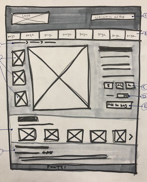
Once I decided on the basic framework, I drew lo-fi wireframes by hand. These let me try several things, tossing things I decided against, before creating higher fidelity Sketch wireframes.
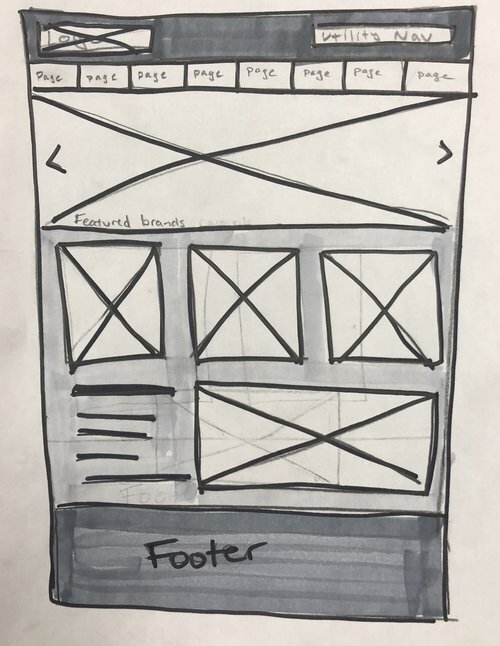
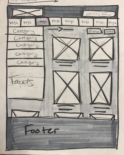
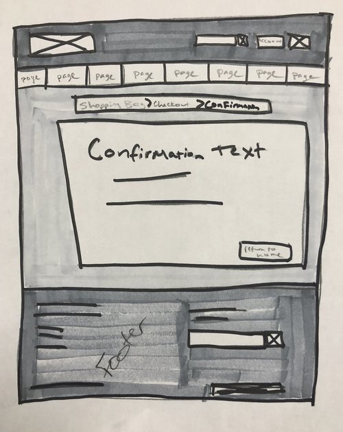
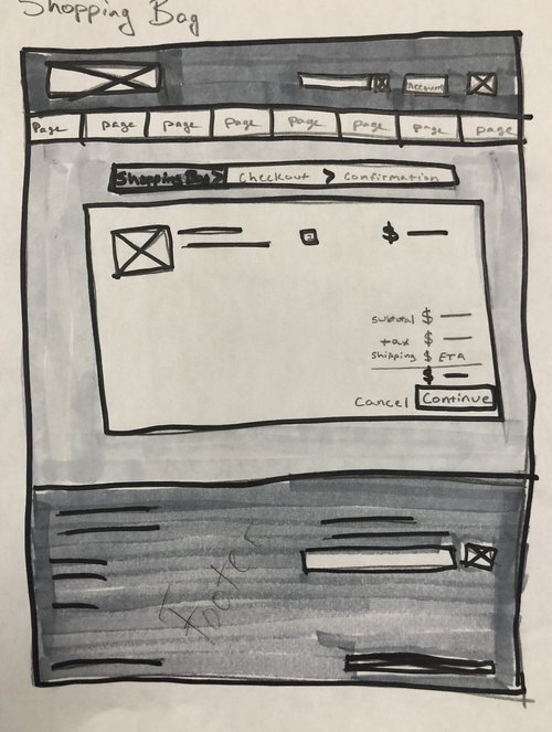
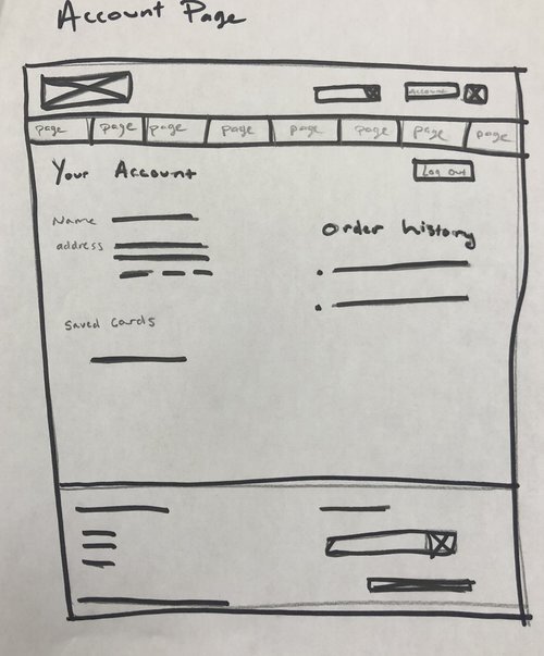
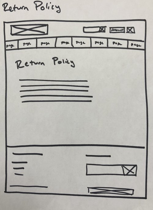
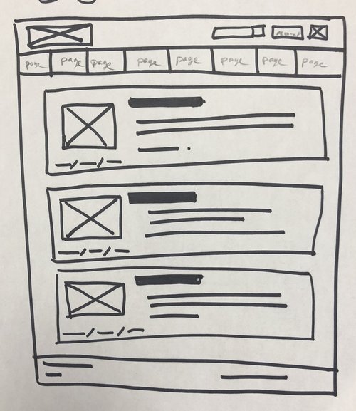
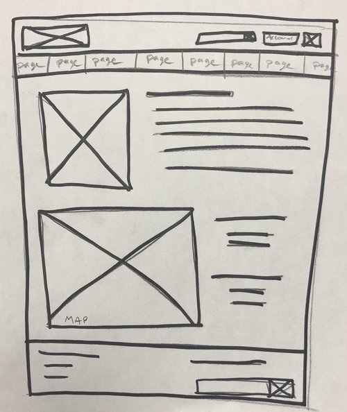
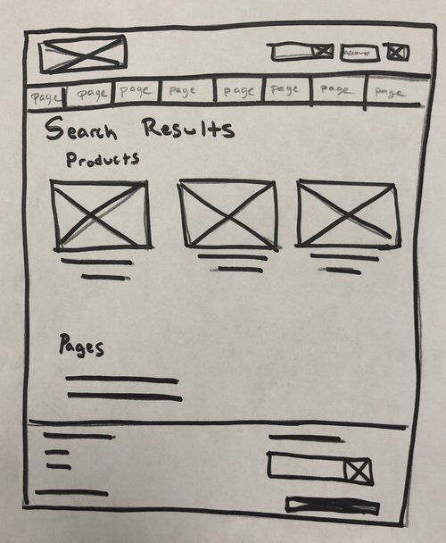
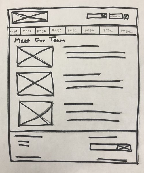
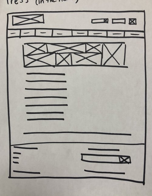




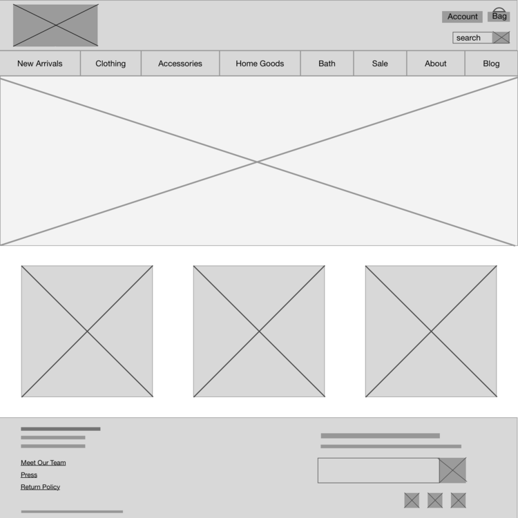
After settling on one design per page, I used Sketch to make higher fidelity wireframes to both show in my presentation to illustrate my design, and also to put in InVision for my clickable prototype. After creating wireframes in Sketch, I exported them to an InVision prototype. I made them clickable, and then I did 4 usability tests with 4 adults likely to shop at Standard Goods. I gave them the following scenario and tasks, based on my persona, Lauren.
Usability Testing
Test Scenarios:
“You’ve just moved to a new neighborhood. Before the move, you really liked shopping at Standard Goods, but now it’s inconvenient to go there. You still want to buy from them, so now you shop on their website.
Task 1. Since you just moved, you are excited to buy some things for your new home. You head to the Standard Goods website to look for a clock.
Task 2. You went to dinner in your old neighborhood with some friends. On your way to your car, you walk past Standard Goods. A super cool, retro pair of red cat eye sunglasses catches your eye, and you really want to buy them, but the shop is closed. When you get home, you want to buy them from the website.
Task 3. A couple weeks ago, you purchased a blue bandana. You love it, and want to give the product a good review online, so other shoppers know how awesome it is. “
The tests went well, and revealed some opportunities to improve on the next iteration. As part of my analysis, I organized test findings into a +/𝚫 chart.
The top priority issues
1.) nothing happened when users clicked “add to bag” and they weren’t sure if it worked or not, and
2.) users wanted to create an account at the beginning of the checkout process rather than save their info at the final stage as I had predicted. These were the first things to change in a next iteration.
A few areas of confusion were due to the lower fidelity of a wireframe. These included not understanding that the box indicating the logo was clickable to get back to the homepage, the lines at the top of pages were breadcrumbs for going back a step or two, and sometimes the wrong navigation bar selection was highlighted since I didn’t make enough wireframes to show each possible option. These issues were lower priority, and would be worked on after the top two issues.
The last thing that I found from testing was that the order of the primary navigation bar was slightly misleading. At the start of every test I had the user look at the homepage and tell me what they thought the site was about. Because Home Goods and Bath (lotions, candles, scents) were centered, users thought the shop was primarily a home goods store. Since most of their items and sales are of clothing and accessories, this was not ideal. Because this was more of a cosmetic issue, reordering the navigation bar was last on the list of iteration revisions.
Deliver
With clear plans for the next iteration, I focused on editing two key screens to demonstrate the changes.


Conclusion + Next Steps
Starting out, the website’s problems of navigation and user interactivity around the products were obvious, and while the website did function, it wasn’t enjoyable to use. Building a review function and including user photos will greatly increase enjoyment and engagement. With the navigation I designed, it will be easier to find products. Designing the checkout process was definitely the part I struggled with the most. I tried many, many designs before settling on my selection. Users wanted to be able to create an account from the very first step, which wasn’t what I had anticipated. It was easily changeable in the iteration, but was an important lesson, reminding me that I’m not the user, and even though I think something is great, that doesn’t mean it’s right.
If this project were to continue, the next steps would be another round of usability testing, getting input from a visual designer to further up the fidelity, and then talking to developers.


