ThinkVet - designed for ThinkPredict
A responsive web app for mobile veterinarians
Role: Interaction Designer
Duration: 14 days
Programs used: Sketch, Omnigraffle, InVision
Skills used: Sketching, wireframing, storyboarding, prototyping, rapidly iterating, team collaboration.
Team members: Carmen O'Toole (user researcher and project manager) and Christine Shu (visual designer and information architect)

Background
Our client came to us with an idea. After winning a hackathon for a product that saves a dog’s microchip information to the blockchain to ensure it never gets lost, he was inspired to create a responsive web app for mobile veterinarians. The finished product will be for all types of veterinarians, and for all screen sizes, but given our limited timeline, we were focusing on the primary use case - a mobile vet using a mobile phone.
After meeting with our client, we created an affinity map to organize all of our client's ideas and get a sense of where to start. This helped us figure out what was most important to our client, what types of features the design would have, what types of deliverables he might expect, and who our users likely are.
From here, we developed a project plan, schedule, and a Statement of Work. Once we got approval from our client, we began in earnest.
Research
Carmen, our user researcher, reached out to vets through facebook, email, and reddit. In the meantime, Christine and I did competitive research comparing several existing veterinary programs, including Avimark, DVmax, Cornerstone, Petware, Pawprint, and Vetter. Since there is no current design or business, we did not do a business analysis, or contextual inquiry. Carmen received 15 responses from vets, so together we did an affinity map to organize the large amount of data.
From this, we started to figure out what features vets need in order to do their job. Seeing the tasks they do, we extrapolated features that our design would need, generating a features list, and from there did feature prioritization.
Next, we listed out all of the features veterinarians said they needed in Carmen's survey, and grouped them into categories. A card sort would have been helpful, but without access to any vets, we based categories on web research and previous experience. Next, we wrote them on Post-It's and made a feature prioritization matrix. Then we rearranged them based on who the feature would be used by.
After rearranging our features into who would use them, we decided to focus exclusively on the vet side for our MVP. Then, from our feature prioritization matrix, we also decided to ignore every feature from the bottom right quadrant, give low priority to the features in the bottom left, and choose a few from the top right to include, based on project scope. Things in the top left quadrant were very important and would all be addressed in our design.
Persona + Storyboard
At this point, our user researcher had finished up our persona, a veterinarian named Amy, and I used that to write context scenarios and a storyboard.
“One of Amy’s clients just called because there is something wrong with her horse. Because the owner can’t transport her horse, Amy drives to the ranch. Once there, she heads out to the barn. She takes out her phone, and pulls up the animal’s history. Not seeing anything of note, she proceeds with the exam, entering her findings into a template as she goes. Upon taking the temperature, she notes that the horse has a fever, and then when checking the skin, she discovers an infected gash. Finishing the exam, the two abnormalities are highlighted, and she diagnoses an infection. She prescribes antibiotics, with ThinkVet assisting in the dose calculation. After voice recording her Exam notes and writing the prescription, she queues the emails to her client of the visit summary and invoice. She retrieves the medication from her kit, gives it to the owner, and shows her care instructions on her phone. The two talk, she queues the email to the client including a copy of the care instructions, and Amy heads back to the office.”
With our persona, Amy, in mind, I worked through a user flow, basing technical aspects on information from someone who works in a vet office. Now, with a solid persona detailing who our users are, a context scenario for when they would use the product, and a user flow detailing how they would use it, I was ready to begin sketching what the screens might look to allow our users to do what they need to be able to do.
Initial Sketches
Our first draft had a menu as the first step, and the exam screens were extremely text heavy. In the beginning I had difficulty balancing veterinary content and minimalist mobile design. The drop downs were an attempt at lessening the scrolling, but it wasn’t working. I ended up eliminating the initial menu and putting content first, with the first screen being the start of the exam process, and adding a tab bar to switch between functions.


Paper
Prototypes
To solve the problem of text heavy, arduous exam screens, I put an image of the animal at the top, similar to WebMD symptom checker, where the user selects the area of the body to focus in on it, and enter information about that area.
The “View pet history” at the top is a swipe down and swipe up page for the vet to easily review past notes, medications, surgeries, and diagnoses. The “In good health” toggle makes it easy for a vet to note the area checked and healthy, and move on, without needing to enter a text confirmation for each body part. The bulleted list shows the things the vet would want to look at, like a checklist, and the notes box is for entering text or recording notes.


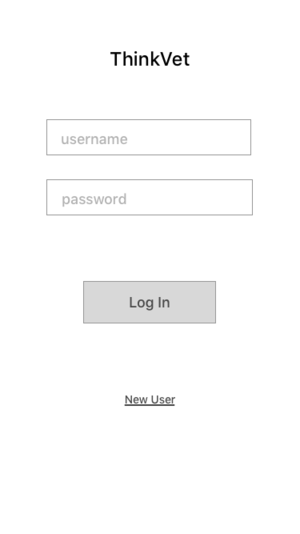
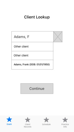
Our researcher tested our paper prototypes and found that users didn't expect to search for the animal, but instead by the owner's name. Some security concerns were raised around only asking a client's name, so we decided to add a birthdate to the wireframes and see how it tested.
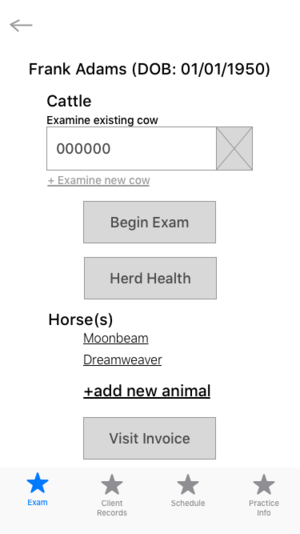
At this time, our researcher also came to the conclusion that almost all mobile veterinarians visited large animals, making frequent visits to farms. Our client had based his vision on a friend who travels to visit the dogs and cats of elderly folks, but with his approval, we pivoted the design to focus on mobile vets who visit farms.
With the changes and new development in mind, I upped the fidelity and began working in Sketch.
Lo-Fi
Wireframes
For the main flow of performing an exam, we stuck with the animal image, and kept the toggle to mark the area as healthy, allowing the vet to move on quickly. The view animal history is a swipe down (and back up) so the vet can easily reference past notes during the exam.
The vet can make notes for both individual cows, and the herd as a whole. From the summary, they can review exam findings and write prescriptions, referrals, order tests, and schedule follow ups.


Tablet
Client Meeting
We were able to meet with our client and his veterinarian friend in the last week of the project. While at his office, our researcher did a usability test with the vet, and we discussed the designs with our client.
The veterinarian gave us some great insights into the vet side of things. She said that using a birthday to verify a client would never be used, so we decided to take it out for further iterations. She wanted to be able to look specifically at medication history during an exam, and said that she usually uses a checklist when she works to make sure she gets everything. She works "nose to tail" and liked the way our design focuses in on specific areas, but asked if it would do that automatically. (It doesn't currently, but that is definitely something we will consider for further iterations.)
Our client didn’t like the bottom tabs, and requested we replace toggles with check boxes. He also wanted round buttons and no text box visible. The vet, concerned about space, asked if it would be possible to move a menu around, to maximize screen space. She indicated the most important things to access during an exam are the animals medical and medication history, and potentially the invoice, if the client asked to see a cost. It took her a minute to notice the swipe down animal history, so our client asked us to remove it and do it in a more obvious way.
Revising the exam screen seemed to be the most important change, so I came up with two new versions. The first, including all requests, and the second, moving and renaming the tab bar instead of the draggable menu idea.


End Results
Based on my wireframes, our visual designer created mockups with the brand colors and icons she created.
At this point our sprint was nearing it’s end, and we prepared our deliverables. We created a side deck detailing our process, and compiled all of our Sketch files, PDFs, PNGs, and documents for our client. We presented our work to him and had a Q&A, concluding the project.
Remaining Questions:
Does the tab and slide out menu combo work for users?
Are the options in the slide out menu discoverable?
How does the design work if the user only has one free hand?
Theoretical Next Steps
Because veterinary software is so complex, this will be a very long project for our client. We created a strong starting point, and also provided some next steps to further the design.
More research is essential. We learned a lot and definitely got some of the basics, but none of us can become experts in veterinary medicine in 3 weeks. It was extremely difficult to get ahold of vets, so I think the best move would be to start the process now of creating a pool of users to talk to and test with. Their input will be a determining factor in wether actual veterinarians want to use the product. Based on further research, designers could begin developing the many other flows of the app.


